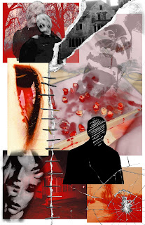
The first one doesn't have the mouth with the fly in the right corner, the second does, can't tell which I like more. In these, I made the rip whiter, and the red more vibrant to match the red heads in the background. (The rip symbolizes how anxiety can tear someone apart >:)) Am working on completely different iterations though and will post when they don't stink.


I love how your images invoke a feeling so easily. Super creepy, but well balanced and cohesive! I think in my head the visual narrative leans close to something like McKamey Manor and not so much anxiety; but I think having a central figure could help that.
ReplyDelete